Admit it: Having a beautiful and fully functioning mobile version of your WordPress website is a must, considering that the significant volume of the internet surfing originates from mobile devices.
You might have already noticed that sometimes, web and mobile versions of the same website have a bit different content. This is done to exclude specific features from the mobile version as they can come up or work incorrectly, or simply be overwhelming on a smaller display. Plus, the Google search engine algorithm ranks mobile-friendly sites higher.
In this article we will cover several ways to make your WordPress website mobile-friendly:
Creating sites with responsive design. The same content and URL is loaded on each device, but CSS is used to alter the page rendering according to the mobile display resolution.
Dynamic serving sites. One URL is loaded, but different content and CSS are used, depending on the device used.
Creating separate URLs for desktop and mobile devices. Different URLs and therefore websites are loaded, e.g., nctest.info and m.nctest.info
Bear in mind that each way has its pros and cons, that is why we recommend to do a SEO research before proceeding.
Responsive web design
Responsive web design uses CSS3 Media Queries. Media Queries is a CSS3 module allowing content rendering to adapt to conditions such as screen resolution, width and height, orientation.
Usually, the file that you will need to edit is style.css. It is located in the /wp-content/themes/theme_name/ directory.
A CSS3 media query usually looks like:
@media only screen and (max-width: 480px) {
}
It is a conditional code which tells the browser to adjust all the styling parameters if the size of the screen is less than or equal to 480px.
To go more granular, you can add min-width and max-width intervals in order to target different devices:
@media only screen and (min-width: 768px) and (max-width: 959px) {
}
All the further styling adjustments should be added in between the {...} brackets.
As an example, we will take the Twenty Ten default theme which is unresponsive by default.
The first code sets the main frame size of the theme to 550px:
#access .menu-header, div.menu, #colophon, #branding, #main, #wrapper, #site-title {
width:550px;
}
Compare how in this case website will look on a mobile device: 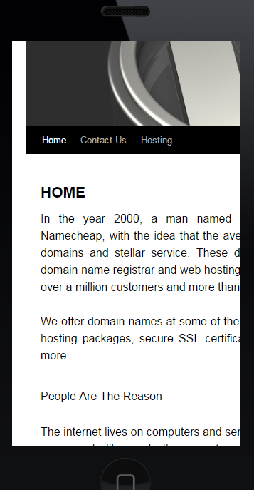
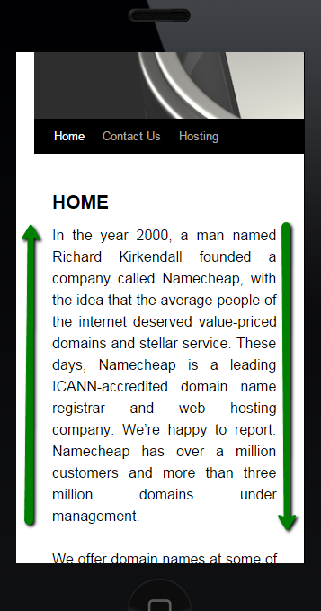
Though as you can see, not all the elements are adjusted to the device screen. You need to adjust separately basically all the elements you have on your website - header image, blog description, navigation bar width, content layer position, etc.
It is possible to hide some of them, like sliders or header images for example. In this way, the mobile version look of your website will be optimized and user-friendly.
The following code should be used (e.g., for header image):
#branding img {
display:none;
}
If you wish to resize the element (header image in example), use
#branding img {
width:100%
}
NOTE: Editing the style.css file requires web development knowledge as well. Do not forget to back up your file before changing it.
Once all the parts of your website are adjusted accordingly, it should have a nice look on mobile devices:
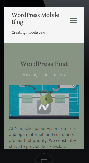
Most of the WordPress themes are created to be responsive - when installing a new theme, you may check its attached look on mobile devices additionally.
If there is none and you are not sure whether the theme you liked is a responsive one or not, you are able to define it in the feature filters while searching for the theme.
1. Log into your WordPress admin dashboard (yourdomain.com/wp-admin), navigate to the Appearance menu, click Themes.
2. Click Add New: 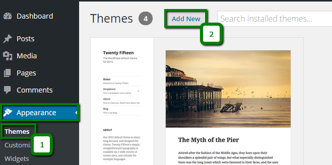
3. Click Feature Filter and check Responsive Layout. Check other options if needed to find a desired theme.
4. Click Apply Filters: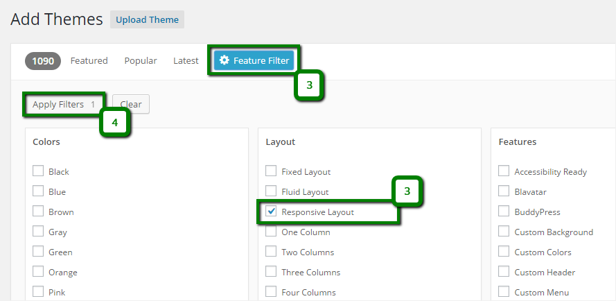
In a few moments you will see the list of themes which correspond to the search features you set.
Dynamic serving websites
Alternatively, you can configure different CSS and content to be pulled depending on the type of the device. This can be achieved by means of the WordPress plugins. Most of them have a number of basic settings available for free.
As an example we will use one of the most popular plugins for designing mobile friendly blogs - WPtouch Mobile Plugin.
First, you need to install and activate it in the Admin dashboard.
Once done, you should choose a theme for your mobile version of the website - navigate to the WPtouch menu, click Themes & Extensions (1). Choose the required theme and click on Setup (2):
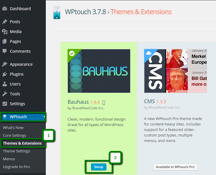
Once the setup is over, you will be able to make the necessary changes and corrections. The plugin options allow performing quite a lot of actions, and most of them are self-explanatory.
Here is how the WPtouch Mobile plugin menu looks:
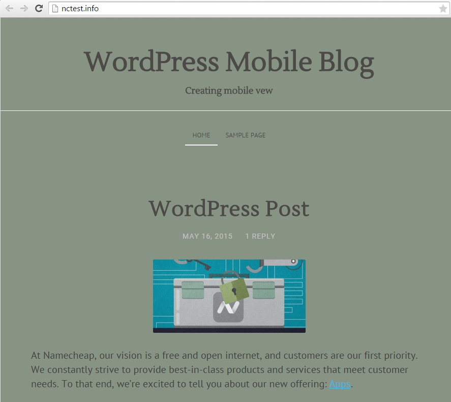
Once all the adjustments are finished, save the changes and check how the website is displayed on a desktop and mobile device: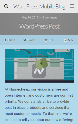
Creating separate URLs for desktop and mobile devices
The last way is the most time-consuming as you will need to:
1. Create a corresponding subdomain for your mobile version, like m.nctest.info.
2. Develop or copy site content to the created subdomain directory path.
3. Install and configure a mobile redirect plugin.
NOTE: If you are going with this option, bear in mind that the two versions of your website will not be automatically synced, as technically, they are different installations. Any edits you make will need to be replicated for the other version.
Once the subdomain is created and the website is adjusted, go ahead and install the plugin in the main website admin dashboard.
As an example we will use the Mobile Site Redirect plugin.
1. Navigate to the Settings menu and click on Mobile Site Redirect.
2. Insert the mobile URL you would like to have. Check any additional options if needed.
3. Click on Update Settings: 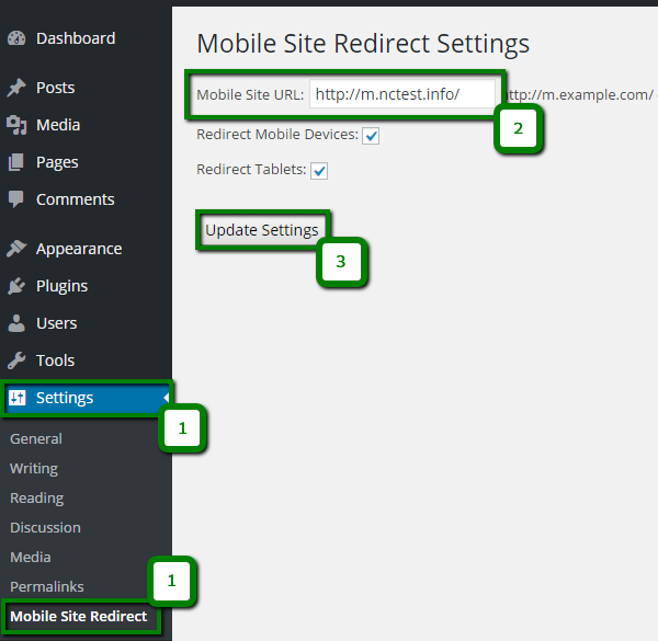
NOTE: We do not provide code debugging and website developing services. This article is provided as a matter of courtesy for your convenience only. Should you face any issues with the mobile version of your website, we suggest that you refer to support forums or contact the website developer.
That's it!